Learning how to choose paint colors for a room can feel confusing when every shade looks different on the wall, in the store, and under your home’s lighting. A color that looks soft and stylish on a paint card can suddenly appear too dark, too yellow, too blue, or completely different once it covers a full wall.
The right paint color should not only look beautiful, but also work with your flooring, furniture, natural light, room size, trim, and overall home style. This guide explains how to choose paint colors for a room in a practical way, so you can make a confident choice without wasting money on the wrong shade.
Why Choosing the Right Paint Color Matters
Paint is one of the most powerful design decisions in any home. It can make a small room feel larger, a dark room feel brighter, and a plain space feel more finished without changing the furniture.
The wrong color, however, can make a room feel cold, dull, crowded, or disconnected from the rest of the house. That is why understanding how to choose the best paint color for a room is more than picking a shade you like online.
Start With the Room, Not the Paint Card
Many homeowners make the mistake of choosing paint first and then trying to match everything else around it. This often creates problems because furniture, rugs, flooring, cabinets, and countertops have limited color options, while paint can be mixed in almost endless shades.
Before you decide on a wall color, look carefully at what already exists in the room. Your sofa, curtains, rug, wood floor, tiles, stone fireplace, cabinets, and artwork should guide the paint color instead of competing with it.
Identify the Fixed Elements in the Room
Fixed elements are the things that are difficult or expensive to change. These include flooring, countertops, tiles, brick, stone, cabinets, large furniture pieces, and built-in features.
If your room has warm wood floors, creamy tiles, or beige stone, a cool gray wall may look disconnected. If your room has cool-toned marble, black fixtures, or gray flooring, a yellow beige paint may feel outdated or heavy.
Common Fixed Elements to Check
| Fixed Element | What to Notice | Paint Color Direction |
|---|---|---|
| Wood floors | Red, orange, yellow, or brown undertones | Warm neutrals, soft greens, balanced whites |
| Gray flooring | Cool, blue, or charcoal undertones | Cool whites, greige, muted blues |
| Cream tiles | Yellow or beige undertones | Warm whites, beige, taupe |
| Brick fireplace | Red, brown, orange, or purple tones | Soft neutrals, warm whites, earthy colors |
| White trim | Bright white, creamy white, or off-white | Match wall color temperature carefully |
| Cabinets | Warm wood, white, gray, navy, or green | Choose walls that support cabinet undertone |
Understand Paint Undertones Before You Choose
One of the biggest reasons paint colors look wrong is because of undertones. Undertone is the hidden color inside a paint shade that becomes more visible when placed next to flooring, furniture, trim, or lighting.
For example, a gray paint may have blue, green, violet, or beige undertones. A white paint may look crisp, creamy, pink, yellow, or gray depending on the room. This is why two colors that look similar on a card can look completely different on the wall.
Warm Undertones
Warm undertones include yellow, red, orange, beige, cream, and brown. These colors usually make a room feel cozy, welcoming, and comfortable.
Warm paint colors often work well in living rooms, dining rooms, bedrooms, and spaces with warm wood furniture. However, if the room already has too much warmth, the wrong warm shade can look yellow, heavy, or outdated.
Cool Undertones
Cool undertones include blue, green, violet, and gray. These colors usually make a space feel calm, clean, fresh, and modern.
Cool paint colors are useful in bathrooms, bedrooms, offices, and rooms with bright natural light. But in a dark or north-facing room, some cool shades can look flat, icy, or dull if they are not balanced with warm décor.
Study the Natural Light in the Room
Lighting is one of the most important parts of how to choose the right paint color for a room. The same paint color can look bright in one room and muddy in another because natural light changes the way color appears.
Before you buy paint, observe the room in the morning, afternoon, and evening. A color should not only look good at one time of day; it should feel balanced during the hours you use the room most.
North-Facing Rooms
North-facing rooms usually receive cooler and softer light. This can make paint colors look more gray, blue, or shadowy.
For these rooms, warm whites, soft greige, creamy neutrals, gentle taupe, and muted warm colors often work better than cold gray or stark white.
South-Facing Rooms
South-facing rooms usually get strong, warm, and bright natural light. This makes many colors appear lighter and warmer throughout the day.
These rooms can handle cooler whites, soft blues, greens, deeper neutrals, and even darker accent colors because the natural brightness keeps the space from feeling too heavy.
East-Facing Rooms
East-facing rooms are bright and warm in the morning but cooler later in the day. A color may look fresh early and more muted by afternoon.
Balanced neutrals, soft greens, warm whites, and gentle beige tones usually work well in east-facing spaces because they can handle shifting light.
West-Facing Rooms
West-facing rooms often look darker in the morning and warmer in the late afternoon. The evening light can make paint colors appear more golden or intense.
Soft neutrals, muted warm tones, and carefully tested colors work best here. Very strong yellows, oranges, or reds may feel too intense when the sun hits the room.
Consider Artificial Lighting Too
Natural light is important, but artificial light also changes paint color. Warm bulbs can make whites look creamy and yellows stronger, while cool bulbs can make gray, blue, and white shades feel sharper.
Before choosing a final color, check your sample under the lights you actually use in the room. This includes ceiling lights, lamps, wall sconces, LED strips, and recessed lighting.
Choose Paint Colors Based on Room Size
Room size affects how color feels. Light colors can make walls feel more open, while dark colors can make a space feel more intimate and dramatic.
This does not mean small rooms must always be white. A small bedroom, powder room, or reading corner can look beautiful in a deep color if the furniture, lighting, and trim are balanced.
Best Colors for Small Rooms
Small rooms usually benefit from colors that reflect light and reduce visual heaviness. Soft white, warm beige, pale gray, muted green, light taupe, and gentle blue can all work well.
If you want a darker color in a small room, use it with good lighting, simple furniture, and lighter trim. This keeps the space stylish rather than cramped.
Best Colors for Large Rooms
Large rooms can sometimes feel empty or cold if the paint color is too pale. In these spaces, mid-tone neutrals, warm greige, olive, clay, navy, charcoal, or deeper beige can create a more grounded feeling.
A large living room with high ceilings may also benefit from a slightly darker wall color or an accent wall. This helps bring the space visually closer and makes it feel more comfortable.
How to Choose a Paint Color for Your Living Room
Many homeowners specifically ask how to choose a paint color for your living room because this is usually the most visible and used area of the home. The living room must feel comfortable for daily use, but also attractive for guests.
Start by looking at your sofa, rug, curtains, flooring, and main furniture pieces. If these items are neutral, you can choose a soft wall color that adds warmth or depth. If the room already has bold furniture or patterned rugs, the wall color should stay calmer.
Living Room Color Tips
When deciding how to choose a paint color for living room spaces, think about the mood you want. A warm neutral creates a cozy and welcoming feel, while a soft green or blue can make the room feel relaxed and fresh.
If your living room connects to the kitchen, dining area, or hallway, choose a color that flows well into nearby spaces. Open areas often look better with one main neutral color and small accents through furniture, trim, or feature walls.
How to Choose the Best Paint Color for a Room by Mood
Color affects the mood of a space. This does not mean every color has one fixed meaning, but certain color families create common feelings in interior design.
Warm colors often feel social and energetic, while cool colors feel calm and restful. Neutrals can feel clean, classic, modern, cozy, or luxurious depending on their undertone.
Mood-Based Paint Color Guide
| Room Mood | Best Color Families | Works Well In |
| Calm and relaxing | Soft blue, sage green, warm white, pale gray | Bedrooms, bathrooms, reading rooms |
| Cozy and warm | Beige, taupe, cream, terracotta, warm greige | Living rooms, dining rooms |
| Fresh and clean | Soft white, light gray, blue-green, off-white | Kitchens, bathrooms, laundry rooms |
| Elegant and dramatic | Navy, charcoal, deep green, muted plum | Dining rooms, offices, accent walls |
| Bright and cheerful | Pale yellow, soft peach, warm white | Breakfast rooms, kids’ rooms |
| Natural and earthy | Olive, clay, sand, mushroom, brown | Living rooms, bedrooms, entryways |
Create Flow From Room to Room
A home looks more polished when paint colors connect instead of feeling random. This does not mean every room must be the same color, but the colors should share a similar temperature, undertone, or design style.
For example, if your main living areas use warm neutrals, nearby rooms should not suddenly shift into cold blue-gray unless there is a clear design reason. A consistent trim color can also help connect different wall colors throughout the home.
Should Open Rooms Be the Same Paint Color?
If your kitchen, dining room, and living room open into one another, using the same paint color can create a cleaner and larger look. This is especially helpful in smaller homes or open-plan layouts.
However, you can still create zones by using different shades from the same color family. For example, a warm white in the kitchen, soft greige in the living room, and deeper beige in the dining area can feel connected without looking flat.
Use the 60-30-10 Rule for Balance
The 60-30-10 rule is a simple interior design method that helps balance color in a room. About 60% of the room should be the main color, 30% should be a secondary color, and 10% should be an accent color.
Your wall paint usually becomes the 60% color, while furniture, rugs, and curtains create the 30%. Smaller details like pillows, artwork, lamps, vases, and décor create the final 10%.
Don’t Choose Paint From a Screen Only
Online photos are useful for inspiration, but they should never be your final decision. Screens, filters, editing, camera settings, and lighting can all change the way a paint color looks.
A paint color that looks perfect in someone else’s living room may look completely different in your home. Use online images to choose a color family, then test real samples in your own space.
Narrow Down Your Paint Choices
Looking at hundreds of paint colors can lead to decision fatigue. Instead of trying to compare everything, start with one color family such as warm white, greige, sage green, beige, blue, or taupe.
Then choose 5 to 8 possible shades from that family and bring them into the room. Compare them against your flooring, trim, sofa, curtains, and natural light before buying sample pots.
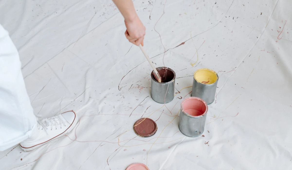
Test Paint Samples the Right Way
One of the most important steps in how to choose paint colors for a room is testing samples before committing to gallons of paint. Many homeowners skip this step and regret it after the walls are painted.
Instead of relying only on small paint chips, purchase sample pots or peel-and-stick paint samples. View them in morning light, afternoon sunlight, and evening artificial lighting to understand how the color changes throughout the day.
Use Large Sample Boards
Paint colors appear very different on a large surface than on a tiny sample card. Create sample boards using poster board or foam board and paint at least two coats on them.
Move these boards around the room and place them near furniture, flooring, curtains, and trim. This method provides a more accurate picture of how the final color will look.
How to Choose Paint Sheen Along With Color
Many homeowners focus only on color and forget about sheen. However, sheen affects how light reflects from the wall and can change how a paint color appears.
A flat finish absorbs light and hides wall imperfections, while higher-sheen finishes reflect more light and often make colors appear slightly brighter.
Common Paint Sheens
| Sheen Type | Best Use |
|---|---|
| Flat/Matte | Bedrooms, ceilings, low-traffic areas |
| Eggshell | Living rooms, dining rooms |
| Satin | Hallways, kitchens, family rooms |
| Semi-Gloss | Trim, doors, cabinets |
| Gloss | Decorative details and furniture |
For most living spaces, eggshell offers a good balance between durability and appearance.
Common Mistakes to Avoid When Choosing Paint Colors
Many paint disappointments happen because of avoidable mistakes. Understanding these mistakes can save time, money, and frustration.
The goal is not finding the trendiest color. The goal is finding a color that works in your specific home with your lighting and furnishings.
Choosing Paint Before Furniture
Paint offers unlimited color choices, while furniture and rugs offer limited choices. Always work from the harder-to-change elements first.
Ignoring Undertones
A gray paint may look neutral until it suddenly appears blue or green beside your flooring. Always compare colors against fixed room finishes.
Testing Only One Color
Testing a single paint color provides no comparison. Always test at least three to five similar shades to identify the best option.
Viewing Samples at One Time of Day
A color that looks perfect at noon may appear completely different after sunset. Evaluate samples under multiple lighting conditions.
Following Trends Blindly
Popular paint colors may not work with your home’s architecture, flooring, or décor. Trends change, but well-balanced color choices remain attractive for years.
Room-by-Room Paint Color Recommendations
Different rooms serve different purposes, so paint choices should support the way each room is used.
Living Room
For homeowners wondering how to choose a paint color for my living room, warm neutrals, greige, soft green, beige, and muted blue are versatile options that work with many furniture styles.
These colors create a welcoming environment while remaining flexible for future décor changes.
Bedroom
Bedrooms benefit from calming colors such as soft blue, sage green, muted gray-green, warm white, and gentle taupe.
These colors promote relaxation and help create a peaceful retreat.
Kitchen
Kitchens often look best with bright but balanced colors. Warm whites, creamy whites, soft greige, pale green, and muted blue remain popular because they work well with cabinets and countertops.
Bathroom
Bathrooms can handle slightly cooler colors because water, tile, and fixtures naturally create a fresh atmosphere. Soft blue, pale green, gray, and crisp white are reliable choices.
Home Office
Home offices benefit from colors that support concentration without feeling dull. Muted green, dusty blue, warm gray, and soft beige can help create a productive environment.
How to Choose Paint Colors for an Entire House
When painting multiple rooms, homeowners often struggle with consistency. The easiest solution is to create a whole-house color palette.
Choose one primary neutral that works throughout the home, then add complementary colors in selected rooms. This approach creates visual flow while still giving each space its own personality.
Simple Whole-House Palette Example
- Main Wall Color: Warm Greige
- Trim Color: Soft White
- Living Room Accent: Sage Green
- Bedroom Accent: Dusty Blue
- Dining Room Accent: Deep Olive
This method keeps the home cohesive while preventing every room from looking identical.
The Paint Color Selection Formula
If you still feel overwhelmed, use this simple formula:
Step 1
Identify fixed elements such as flooring, cabinets, countertops, and furniture.
Step 2
Determine whether those elements lean warm or cool.
Step 3
Analyze the room’s natural and artificial lighting.
Step 4
Choose a color family that complements existing finishes.
Step 5
Select three to five sample colors.
Step 6
Test samples on large boards.
Step 7
Observe colors for several days.
Step 8
Choose the shade that performs best under all conditions.
Following this process dramatically reduces the chances of choosing the wrong paint color.
Pros and Cons
| Light Paint Colors | Dark Paint Colors |
| Make rooms feel larger | Create intimacy and drama |
| Reflect more light | Add depth and character |
| Easy to coordinate with décor | Hide some visual imperfections |
| Timeless and versatile | Strong design statement |
| Ideal for small rooms | Great for accent walls |
| Can sometimes feel plain | Can make small rooms feel smaller |
Infographic: How to Choose Paint Colors for a Room Formula
How to Choose Paint Colors for a Room Formula
Analyze Existing Elements
Flooring + Furniture + Cabinets + Decor
↓
Identify Undertones
Warm Undertones or Cool Undertones
↓
Evaluate Lighting
North + South + East + West Facing Rooms
↓
Choose a Color Family
White + Greige + Beige + Green + Blue + Taupe
↓
Test Large Samples
Boards or Peel-and-Stick Samples
↓
Check Morning and Evening Light
↓
Compare With Furniture and Flooring
↓
Select the Final Paint Color With Confidence
Frequently Asked Questions
How do I know what paint color is right for my room?
Start by analyzing your flooring, furniture, lighting, and décor. Then test several paint samples in the room before making a final decision.
How do I choose the right paint color for a room?
The best method is to identify warm or cool undertones in existing finishes, evaluate lighting conditions, and test multiple paint samples over several days.
How do I choose a paint color for my living room?
Choose a color that complements your sofa, flooring, and décor. Warm neutrals, greige, soft greens, and muted blues are versatile options for most living rooms.
Should every room in the house be the same color?
Not necessarily. However, using colors from the same palette helps create flow and makes the home feel more cohesive.
Why does paint look different on the wall?
Paint changes appearance because of lighting, undertones, surrounding colors, and room size. This is why testing samples is essential.
What is the safest paint color for most homes?
Warm whites, soft greige, and light beige colors are among the most versatile choices because they work with a wide range of furniture and finishes.
How many paint samples should I test?
Testing three to five similar shades is usually enough to compare undertones and identify the best option.
Conclusion
Understanding how to choose paint colors for a room is not about finding the trendiest shade or copying a color from a magazine. It is about selecting a color that works with your home’s lighting, furnishings, fixed finishes, and desired atmosphere.
By studying undertones, evaluating natural light, testing large samples, and creating a room-to-room color strategy, you can avoid costly mistakes and choose paint with confidence. Whether you are deciding how to choose a paint color for your living room, planning a whole-house palette, or simply refreshing one room, a thoughtful approach will help you create a space that looks beautiful for years to come.